For this project, I set out to write a dissertation on designing characters to explore the use of shapes and colours to see if it made character design better. To test the theory I would put it to the test on my own characters. I believe I have done what I set out to do and have informed my practical through my research. I am very happy with the result, especially on the bat. I feel this project has made me a better character designer and I am looking forward to doing more.
If i were to do this project again I think I would do more non related character designs before I started to design the final one as this was good with the few i did as it helped me learn and practice, i wish I had time to do more of these.
Overall though I am very pleased with this project and I believe it will be a great portfolio piece and hopefully will be the base of a successful animation.
Thursday 14 January 2016

Wednesday 13 January 2016
Presentation of final work
Here is how i wish to present my practical work. This shows the workings through and the final products. I will also submit the final boards themselves i think. I think this booklet is a professional, elegant, concise way of presenting my work that looks good and could even be printed out and still work
http://issuu.com/elysejackson/docs/practical_booklet-please_look_at_we?e=16839447/33061000
Quetzalcoatl style sheet
This is the style sheet for Quetzalcoatl that explains his design including the use of shape. I think this looks good and ties in well with the bat one and is informative enough that the animator will be able to draw this in whatever form it needs.

Quetzalcoatl
These are the various facial expressions of Quetzalcoatl. I believe these work well. The eyes were difficult as the sides of the face are not face on the they are slanted back slightly. Cartooning the ultimate character design book by Chris Hart p 35 was very helpful in drawing facial expressions.

Quetzalcoatl
I then refined Quetzalcoatls action pose which would be when he gets angry and it looks much better than the original design i did with bigger and better wings and a better facial expression. I even moved his tail as i believe this would be a secondary action that shows his emotion much like the bats ears. As Quetzalcoatl is quite a calm and still character that doesn't appear much, this is the only action pose i did as i don't believe others were necessary as he won't use them.


Quetzalcoatl
Next I did the turnaround. I don't expect Quetzalcoatl to move very much as he is more like a deity or idol which tend to be more still that people just go and visit. For this reason I just did a basic turnaround. I like the side view best as it shows his more regal pose with the big wings and head feathers.


Quetzalcoatl
I decided that Quetzalcoatl looked too nice and not important enough to say he is a god. To combat this i decided to make the wings stand up and out a bit to create a more regal feel. I also changed the facial expression so look less cute as this makes him seem more like a friend and not someone that important.


Monday 11 January 2016
Bat style sheet
I created a style sheet as this is what designers do to put their character across and try and give the animator the best idea they can about the character they have designed. This needs to include, facial expressions, turn arounds, action poses, and possibly a bit about how to draw the character. So here is mine which include all of these things including a few comments about why things are the way they are.


Bat design
Putting the bat into poses was quite difficult but having the turnaround for reference was helpful. Although it was difficult, it is a necessary part of character design as it shows what your character is like in his personality rather than just stood still.


I used 3d shapes the start off these images as it helped to get the positioning right and angles. I learnt this from the book How to draw comics the marvel way which helped me a lot and really improved my drawing abilities. As you can see from the first image, I didn't start this way. This caused my design to look flat and lifeless. A little angling can work wonders! I learnt this from creating characters with personality by Tom Bancroft p.71.where he describes tilts, and curves and rhythm


I think overall the poses work well and this has made me really look forward to animating this bat. I think i could still learn a lot about movement in my drawings but i think it just takes practice which i intend to.
Bat design
I created a sheet with different facial expressions on. This helps me get to know the character and the way his face moves and allows me to figure out how he shows his emotions. I figured out that it would be interesting for the bat to show its emotions like a cat- in his ears. I think this works really well. Then of course most of the rest is in the eyes.


Bat design
It was decided that there should be no texture as it looked more professional but also would make it not so complicated to animate in the future. After deciding this and getting the design down to how i wanted it, I made a turnaround. p57 in creating character with personality by Tom Bancroft was helpful when it came to the side view. it started off really flat but then i remembered how making things stick out farther can create more appeal.

This consists of the front and back view, each profile view, and the respective 3/4 views. This helps to figure out the size and shape of the character in 3d form so when it comes to posing the character later we know its form.

This consists of the front and back view, each profile view, and the respective 3/4 views. This helps to figure out the size and shape of the character in 3d form so when it comes to posing the character later we know its form.
Bat design
I set up a colour scheme voting sheet and took it to our crit and asked everyone in the class to vote on what they prefer.
After much discussion we decided together that the bat should be grey with green eyes. This shows that the bat is a boring colour which is more reason for the change and also grey is a colour associated with the antagonist as it is a form of black.

After much discussion we decided together that the bat should be grey with green eyes. This shows that the bat is a boring colour which is more reason for the change and also grey is a colour associated with the antagonist as it is a form of black.

Wednesday 6 January 2016
Tutorial #6
Practical needs to be finished including style sheets.
Written - make sure quotations are right, illustrations are all cited correctly. Rephrase a lot of it. Tidy up layout. Needs proofreading. Then binding.
Hopefully I will get this done by Friday.
Written - make sure quotations are right, illustrations are all cited correctly. Rephrase a lot of it. Tidy up layout. Needs proofreading. Then binding.
Hopefully I will get this done by Friday.
Thursday 10 December 2015
colour scheme
After lots of different colour scheme choices i made a board so people could see the different ones and how they work so i could get feedback.
The general consensus of the class was that they thought the grey was best for the story as it is a boring dull colour which is what the bat is unhappy about. And the yellow eyes stand out well but after some discussing i suggested green eyes to portray his envy at the birds colours and everyone seemed to think this was a really good idea. All but one person said they prefer no texture too. A very helpful crit.
So here is the final colours.

Friday 4 December 2015
Bat design
I decided to colour in my original bat idea as it is the one i feel most represents the characters personality at the moment. I may change bits.
I have used a texture on the bats body to make him look a bit furry and then no texture on the wings to try and make them look leathery. I have used dull brownish greys as that is what he is in the story and that is why he wants to be colourful.
I feel like this image really explains the beginning of the story where the bat is feeling left out and ugly and like 'why do i have to be grey when all of the other birds get to be pretty colours. I want to look like them' He is holding his wings showing the dullness and he looks sad.

And this image really shows his temper. One minute you can be feeling sorry for him and the next he's like 'fine i don't need your help' thinking he's better than everyone else and getting frustrated that some birds won't give him feathers and then angry again when Quetzalcoatl won't get the birds to give him a second feather.

Wednesday 2 December 2015
Quetzalcoatl
Here is a coloured version of one of my designs. I decided to do it in colour to see how it would work as a lot of this character is about its colour. I think it works quite well but it is definitely missing something that i can't figure out yet... I think i will have to show it to people and see what they think. Maybe less of the snake body like shorter? I like how the colours run into each other though think that works well.
I also think that the normal ones eyes need to be a bit less doey and innocent, It loots quite cute like this and he is supposed to be the mentor character therefore old and wise and knowledgeable and these eyes do not say that. They say aw hey look how cute and dumb i am.


I also think that the normal ones eyes need to be a bit less doey and innocent, It loots quite cute like this and he is supposed to be the mentor character therefore old and wise and knowledgeable and these eyes do not say that. They say aw hey look how cute and dumb i am.

I need to work on a better angry snake face but there is still something off about this concept. It doesn't quite feel like the wings are part of him. Perhaps its the shape of them? or perhaps it need less of a drastic line between the red and blue so it feels like it blends and belongs?

Also Im wondering if i need the black like or if it would look nicer without... because i did this from a photo of the bird and i quite like it. But to animate it maybe that would make things difficult. Im also thinking the colours need to be muted a little like the bird.

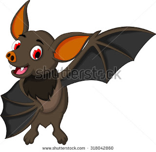
Bat
With the bat I started off by drawing real bats as it is something i have never attempted before. I wasn't very impressed with this and was wondering how on earth I am going to be able to design a bat if i can't even draw them.

So I decided to look at pre existing cartoon bats and see how other people got around this. A lot of bats were too simple like just their outline or like a round head with wings popping off but i wanted more of a body so my character can act better. I liked the cuteness of a lot of them but my character is a little bit mean so it can't be too cute but also he isn't evil. I want it to be simple enough to draw over and over but i don't like the really really simple style. It needs that little bit of detail to make it feel more real and connect to it.

So i sat down and thought about all the things I like and don't like and the messages i want to put forward. I decided it needed a fairly round shape to show that he is not harmful but he is also a bit lazy. I also wanted to anthropomorphise him quite a lot as i think this works well for him acting.

After a did the initial circles i added in the outlines and refined the shape of what i think he should look like.

Then added the face, a bit sad because he is lonely. I used my favourite nose and mouth from the cartoons i had found online as i thought they worked really well. Then nice big eyes. It seems like eyebrows actually might be quite important for this character because it think he has quite a lot of emotions to portray throughout the animation.


Then i looked into different face shaped because something might work better. As you can see i tried a bit more realistic and cool or a bit goofy...

And here we have the square, diamond, triangle and oval shapes of face. I think the best out of these would be the square. The others just don't seem to fit. I think its because there needs to be more room at the mouth because he talks a lot. I love the oval one at the bottom but it just looks too cute for the character.
I like how the first drawing is stood too i feel this is very like the characters personality.

Quetzalcoatl
I started off by just drawing birds, real and cartoon. To get a feel of how other people seem to be designing birds. And i find i learn why people do things by copying them to start with. Like i like the wings doing gestures like the bottom left bird on the second page.

I then researched the Quetzal bird as you have seen in the previous post. I started doing some drawings of this to get a feel of the bird and see which bits I would like to include in the design. I found the pattern of the feathers and the colours and the tail all very beautiful and would like to do my best to keep those in the design.

Next I started mixing the snake in and seeing what worked. I don't like the top left design as it reminds me of the first Jurassic park and that was a dinosaur not a bird snake. Im also not so keen on the opposite page. It seems like the wings are just stuck onto a snake and it just all looks rather odd. The bottom left looks quite nice but maybe needs to be more obvious that they're wings?

Then I looked at king cobras and i thought it would be brilliant because of the wide regal neck I thought this would be great to put feathers on as it looks quite like wings. When a cobra gets angry it flares this part on its neck and i thought wouldn't it be great if he stuck his wings out when this happened?! And then puts the wings back like a bird does when its done flying.

I am quite liking how this is looking so far and i think i may try and draw and refine this on photoshop and get some nice colours in there. Then ask people what they think and make sure the silhouette works. I think it will definitely be very different to the bat so i think it may work together.
Monday 30 November 2015
Quetzalcoatl
Quetzalcoatl is the other main character in the story. He is a god and is a feathered serpent:
"The god Quetzalcoatl, is the Feathered Serpent or Precious Twin. He is the god intelligence and self-reflection, a patron of priests.
Quetzalcoatl is a primordial god of creation, a giver of life. With his opposite Tezcatlipocahe created the world. Quetzalcoatl is also called White Tezcatlipoca, to contrast him to the black Tezcatlipoca.
As the Lord of the East he is associated with the morning star, his twin brother Xolotl was the evening star (Venus). As the morning star he was known by the nameTlahuizcalpantecuhtli, "lord of the star of the dawn." An other representation of Quetzalcoatl is Ehecatl, the Wind God. His calendrical name is Ce Acatl (One Reed).
After the last world, the Fourth Sun had been destroyed, Quetzalcoatl went to Mictlan, the land of the death, and created our current world, the Fifth Sun, by using his own blood to give new life to bones. Quetzalcoatl is also the giver of maize (corn) to mankind.
In the tonalpohualli, Quetzalcoatl rules over both the second day, Ehecatl (wind), and the second trecena, 1-Ocelotl (jaguar). He is Lord of the Day for days with number 9("chicunahui" in Nahuatl)."
Read more: http://www.mythencyclopedia.com/Pr-Sa/Quetzalcoatl.html#ixzz3syt0KpZL


I think the feathers are just faulous especially the tail and the colours, i would really like to incorporate these in my designs.


A lot of them have gone for like a dragon kind of look and i actually really like that. I dont think it needs the feet like the second to last one though and i like the idea of using the wings as hands.
"The god Quetzalcoatl, is the Feathered Serpent or Precious Twin. He is the god intelligence and self-reflection, a patron of priests.
Quetzalcoatl is a primordial god of creation, a giver of life. With his opposite Tezcatlipocahe created the world. Quetzalcoatl is also called White Tezcatlipoca, to contrast him to the black Tezcatlipoca.
As the Lord of the East he is associated with the morning star, his twin brother Xolotl was the evening star (Venus). As the morning star he was known by the nameTlahuizcalpantecuhtli, "lord of the star of the dawn." An other representation of Quetzalcoatl is Ehecatl, the Wind God. His calendrical name is Ce Acatl (One Reed).
After the last world, the Fourth Sun had been destroyed, Quetzalcoatl went to Mictlan, the land of the death, and created our current world, the Fifth Sun, by using his own blood to give new life to bones. Quetzalcoatl is also the giver of maize (corn) to mankind.
In the tonalpohualli, Quetzalcoatl rules over both the second day, Ehecatl (wind), and the second trecena, 1-Ocelotl (jaguar). He is Lord of the Day for days with number 9("chicunahui" in Nahuatl)."
The name Quetzalcoatl means "Feathered Serpent." It brings together the magnificent green-plumed quetzal bird, symbolizing the heavens and the wind, and the snake, symbolizing the earth and fertility.
Read more: http://www.mythencyclopedia.com/Pr-Sa/Quetzalcoatl.html#ixzz3sysS3gUM
Read more: http://www.mythencyclopedia.com/Pr-Sa/Quetzalcoatl.html#ixzz3sysS3gUM
The God. Quetzalcoatl was portrayed in two ways. As the Feathered Serpent, he was a snake with wings or covered with feathers. He could also appear in human form as a warrior wearing a tall, cone-shaped crown or cap made of ocelot skin and a pendant fashioned of jade or a conchshell. The pendant, known as the "wind jewel," symbolized one of Quetzalcoatl's other roles, that of Ehecatl, god of wind and movement. Buildings dedicated to this god were circular or cylindrical in shape to minimize their resistance to the wind.
According to some accounts, Quetzalcoatl was the son of the sun and of the earth goddess Coatlicue. He and three brother gods created the sun, the heavens, and the earth. In the Aztec creation myth, Quetzalcoatl's cosmic conflicts with the god Tezcatlipoca brought about the creation and destruction of a series of four suns and earths, leading to the fifth sun and today's earth.
At first there were no people under the fifth sun. The inhabitants of the earlier worlds had died, and their bones littered Mictlan, the underworld. Quetzalcoatl and his twin, Xolotl, journeyed to Mictlan to find the bones, arousing the fury of the Death Lord. As he fled from the underworld, Quetzalcoatl dropped the bones, and they broke into pieces. He gathered up the pieces and took them to the earth goddess Cihuacoatl (Snake Woman), who ground them into flour. Quetzalcoatl moistened the flour with his own blood, which gave it life. Then he and Xolotl shaped the mixture into human forms and taught the new creatures how to reproduce themselves.
Read more: http://www.mythencyclopedia.com/Pr-Sa/Quetzalcoatl.html#ixzz3syt0KpZL
This is the fantastic Quetzalcoatl bird:


I think the feathers are just faulous especially the tail and the colours, i would really like to incorporate these in my designs.
His hair is pretty cool too and those front green feathers might work well as hands.
Here are some existing images of Quetzalcoatl that i like:


Tuesday 17 November 2015
Cartoon bats
Here are some bat character designs that I am quite fond of, I think they all work well for kids and are not too scary. Some are more detailed than others. As this is being designed for an animation of some length, I think it would be a good idea to make my design not too complicated. I like how on some of these the wings are being used as hands. I intend to do this too. I can't decide whether to go as far as to actually give him hands though like one of these designs or if thats taking it too far.


Bat design
 So i have found out that the bats in Mexico are called free tailed bats. For my character design to be correct I would have to create one of these. However they are really ugly and actually quite scary And character designs need to have appeal to be engaging. And my target audience is going to be kids at around about 6-10 years old and i think they would be freaked out by this:


Fruit bats are a lot less scary and may possibly be better to use for kids but this wouldn't be native? so i was thinking of doing a mix of the two.


The eyes are much more engaging and less threatening and they look less mangy and dangerous. I think i could use the aesthetics of the fruit bat with the anatomy of the free tailed bat. So that would include a wing span of about 30-35cm a long tail and slightly bigger ears.
Subscribe to:
Posts (Atom)